Thanks for asking. It’s been a couple of months since I left Autodesk. I’ve made a few posts, started to settle into a rhythm. Time to have a look at the analytics and see if anyone is reading this stuff.
When I set the blog up I enabled Google Analytics. I thought briefly about finding something open source or rolling my own and in the end decided that life’s too short. Google Analytics is really easy to get started with. Sign up for a free account, grab a snippet of JavaScript and add it to the head section of each page. As I’m using Jekyll for my blog all I had to do was change my default template.
For some reason it takes a couple of days before data starts showing up in the console so I wasted some time trying to figure out why it wasn’t working. I hadn’t done anything wrong. Just needed to wait.
So, what have I learnt?
Users
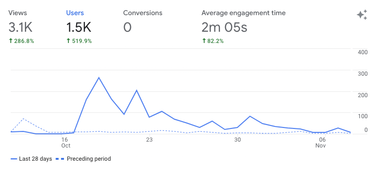
The analytics console overview page has two cards. The first shows you changes in users (or a choice of other metrics) over time and lets you compare two periods. I can conveniently compare my first and second month of blogging.
- I have 1500 users this month with 1400 being new
- In general I’m consistently increasing my number of users, with rate of growth higher in the second month compared to the first
- There was a huge increase in users 18th-20th October the impact of which has only just petered out. We’ll find out later what that was about.
The other card shows a real time view of users per minute over the last 30 minutes. At my scale its not very exciting.
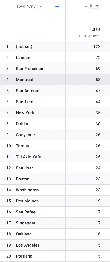
Demographics
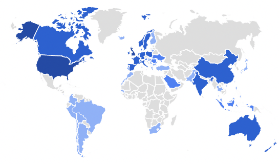
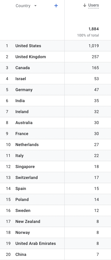
The Reports section of the console has three areas of interest for me. The first is Demographics. I have users all over the world! I suspect the distribution is a close match for how Autodesk employees and ex-employees are distributed.
Great to see so many of you from my town of Sheffield. The friends and family effect at work.
 |
 |
Posts
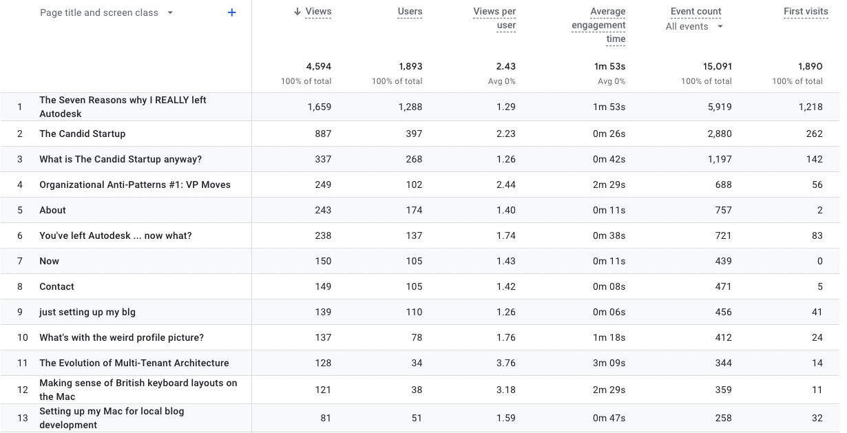
In the Engagement section we have the weirdly named “Pages and screens: Page title and screen class” report. This tells me what you’ve been looking at. No surprise that my post on leaving Autodesk published on 18th October is in the number one spot. This one clearly resonated with many of you and must have been widely shared to bring in 1200 new users. Now I have a dilemma. Was it the content or the intentionally clickbait title that did the trick?
The First Visits metric is interesting. Almost all of the readers for the leaving Autodesk post had it as their first visit. Unfortunately, most of them left without visiting the home page to see if there were any other interesting posts.
The other thing that caught my eye is the views per user and average engagement time metrics. The lighter posts get most users. However, the longer, more technical ones get a greater engagement time and more views from their more select audience.
Sources
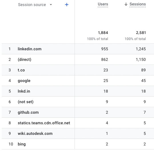
Where have these 100s of users come from? Almost all of you came from LinkedIn. The (direct) source is for those visits that didn’t include a referrer header. Either you came direct or, more likely, are using a browser configured not to provide referrer data.
Apart from that there are a handful from Twitter (t.co), Google Search, GitHub and a few odds and ends.
I particularly want to thank the person at Autodesk that saved a link to the blog on the Autodesk corporate wiki. I miss that wiki.
Looks like posting a link to each published article gets onto a lot of people’s feeds. LinkedIn has some analytics tools of its own. What can they tell me?
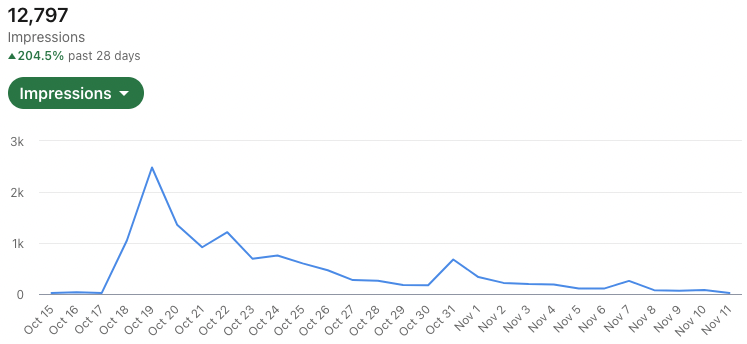
That’s a familiar looking curve. Spot on correlation between the number of impressions of my posts on people’s feeds and new users visting the blog.
Search
What about those 25 users that came via Google?
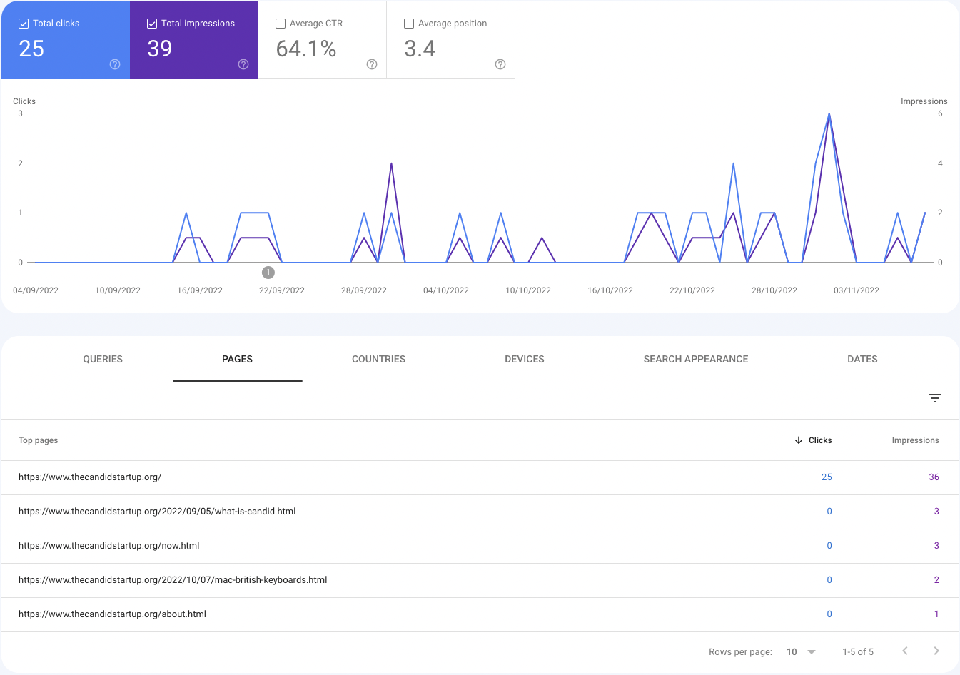
Google has a Search Console that provides some analytics about the search performance of your site. It’s a bit of a pain to set up. You create a free account and point it at your domain. You then need to prove you own your domain by adding a magic string to a DNS record. Like Google Analytics its hard to tell whether its working with the added fun of dealing with DNS timeouts when you tweak settings. In my case it took a couple of weeks to get anything on my site indexed and another week to get some initial analytics. That lag has continued for each new post.
What I can see is that Google served up 39 links to the blog in search results of which 25 were clicked on. I’d love to know what queries you used but I can’t see that. The Queries tab has a list of “Top Queries” which has the single entry candid startup that resulted in 2 impressions and no clicks. When I try that query myself I mostly get results for failed dental startup Candid. The only queries that work for me are the candid startup and "candid startup" but apparently neither qualify as top queries.
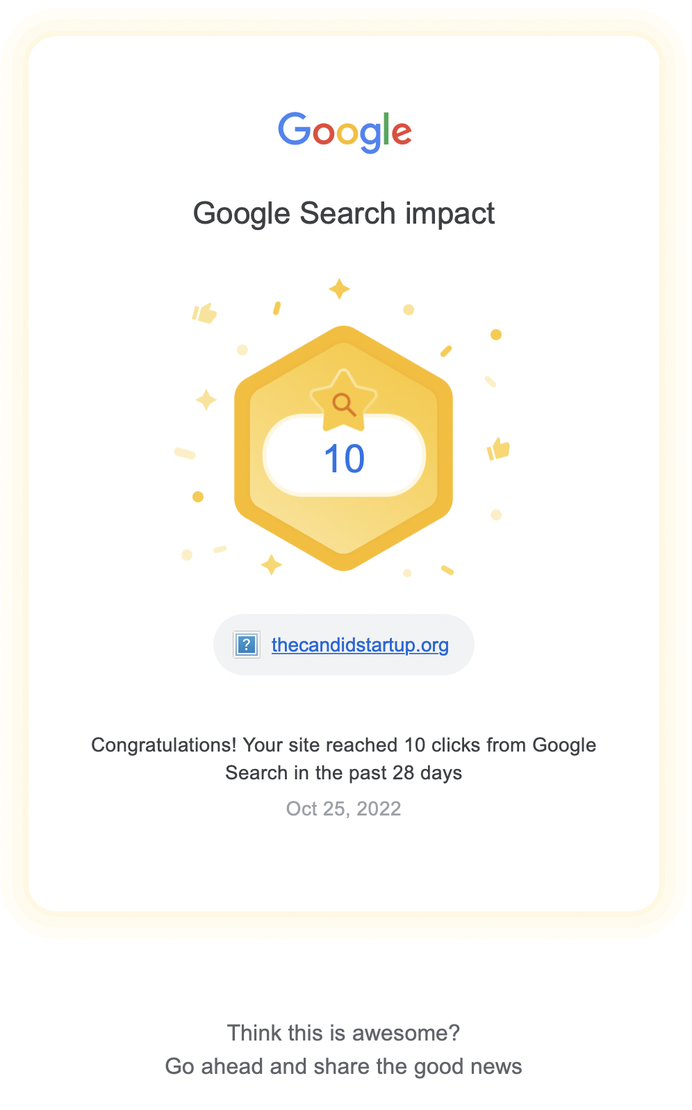
There’s no need to be downhearted. Google has added some gamification to keep you plugging away at the SEO with personalized emails whenever you hit an achievement.