Last time, I left you with a laundry list of things to do next. In the end, I decided to try and do all of them, with the unifying theme of getting react-spreadsheet ready to release.
Constant Propagation
I still had a few hard coded constants in VirtualSpreadsheet that should really be props. They’re all related to layout of the different sub-components within VirtualSpreadsheet.
export interface VirtualSpreadsheetProps<Snapshot> {
  /** Height of input bar
   * @defaultValue 30
   */
  inputBarHeight?: number,

  /** Height of column header
   * @defaultValue 50
   */
  columnHeaderHeight?: number,

  /** Width of row header
   * @defaultValue 100
   */
  rowHeaderWidth?: number,
}
Width and Height
My initial thrown together spreadsheet code passed width and height props through to the internal grid sub-component. Which means that the actual width and height of VirtualSpreadsheet is bigger than the props passed in.
The width and height props now set the size of the overall component, with the grid size calculated based on whatever space is left. I also set a minWidth and minHeight so that the input bar, headers and a reasonable amount of grid are always visible.
const columnTemplate = `${rowHeaderWidth}px 1fr`;
const rowTemplate = `${inputBarHeight}px ${columnHeaderHeight}px 1fr`;
const minWidth = rowHeaderWidth * 2;
const minHeight = inputBarHeight + columnHeaderHeight * 2;
const gridWidth = Math.max(width - rowHeaderWidth, rowHeaderWidth);
const gridHeight = Math.max(height - columnHeaderHeight - inputBarHeight, columnHeaderHeight);
I adjusted the spreadsheet size in Storybook and the sample app so there’s no change in overall appearance.
Auto Size
Now that width and height define the size of the overall component, it’s easy to add an AutoSizer to get the spreadsheet to fill the space available. I added “Full Width” and “Full Screen” Storybook stories to demonstrate.
export const FullWidth: Story = {
  args: {
    theme: theme,
    data: testData,
    width: 0,
    height: 500,
  },
  argTypes:{
    width: {
      table: {
        disable: true
      },
    },
  },
  render: ( {width, height, ...args} ) => (
    <AutoSizer style={{ width: '100%', height }}>
      {({width}) => (
        <VirtualSpreadsheet width={width} height={height} {...args}/>
      )}
    </AutoSizer>
  ),
  parameters: {
    layout: 'fullscreen',
  },
};
The story disables controls for the width arg as width is controlled by the AutoSizer. Note the use of the Storybook “fullscreen” layout so that the story can use the full width. There’s also a custom render method that wraps VirtualSpreadsheet with an AutoSizer set up to fill the available width while using a fixed height.
The “Full Screen” story is the same but with both width and height controlled by the AutoSizer.
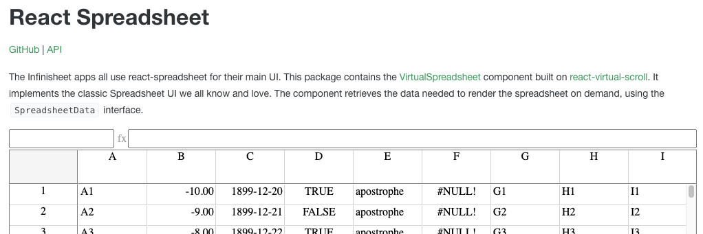
I switched to using the “Full Width” story for the react-spreadsheet landing page.
Read Only
If I release the virtual-spreadsheet package, who would use it? The component is set up for editing, but I haven’t implemented and validated that workflow yet. You go through the motions of changing a cell and nothing happens.
The only useful scenario I can think of is as a viewer of large spreadsheet data. So, I added a readOnly mode (defaults to false) that disables the edit functionality.
export interface VirtualSpreadsheetProps<Snapshot> {
  readOnly?: boolean;
}
The implementation is simple. It’s mostly replacing calls to setEditMode(true) with setEditMode(!readOnly). I also set the read-only attribute on the formula and focus sink inputs.
Infinisheet Types

If I’m going to achieve the full InfiniSheet vision, I need to extract common types like SpreadsheetData and move them into a common interface package.
SpreadsheetData has a dependency on ItemOffsetMapping which is defined in react-virtual-scroll. That will need to move too. To keep things simple, I’m going to define a single infinisheet-types package for all common interfaces.
If I know I need to do a major refactor of the API surface area, I should do it before I release rather than after.
ItemOffsetMapping
I created a stub infinisheet-types package following the same recipe as react-spreadsheet. Although there are lots more stub config files to copy now.
I moved ItemOffsetMapping, FixedSizeItemOffsetMapping and VariableSizeItemOffsetMapping there from react-virtual-scroll. I’m not limiting myself entirely to interfaces. I’m also including small bits of support code where they make sense. I want to minimize complexity for those using react-virtual-scroll stand alone.
Having some real code in the package also avoids special cases. I can use the same base config as any other library package, including unit tests and transpiled and bundled output.
At first I thought I would have to replace {@link ItemOffsetMapping} with {@link @candidstartup/infinisheet-types!ItemOffsetMapping | ItemOffsetMapping} in react-virtual-scroll TSDoc comments. Which is horribly verbose and clumsy. Typedoc and API Extractor handle these cross-package links correctly, but VS Code just removes the {@link} wrapper then fails to format it as a clickable link.
It turns out that both VS Code and Typedoc will handle {@link ItemOffsetMapping} as long as it’s in a context where the TypeScript compiler can resolve the reference. Which is pretty much all cases apart from package documentation comments in index.ts. Annoyingly, API Extractor doesn’t do the same, and warns about broken links. Typedoc already tells me about links that can’t be resolved so I turned the API Extractor warning off.
We’re starting out as we mean to go on by ensuring unit tests and documentation have 100% coverage.
SpreadsheetData
I could then move SpreadsheetData and EmptySpreadsheetData from react-spreadsheet to infinisheet-types. Once again putting in the effort to get 100% unit test and documentation coverage.
Documentation
Documentation was mostly there already. It took 10 minutes to complete what was left in react-spreadsheet.
Unit Tests
Unit tests weren’t in such a good place. I only have some initial stub tests for react-spreadsheet. They render a spreadsheet with some test data and check that expected values appear. There’s no interaction of any sort and a miserable 20% code coverage.
I improved things slightly by getting to 100% coverage on code moved to infinisheet-types. However, I suspect I’m not going to get to 100% coverage in a hurry. What I can do is address the low hanging fruit.
I invested a couple of hours and was delighted to get up to 85% statement coverage and 75% branch coverage. It turned out to be straightforward to cover logical behavior on click to select, use of keyboard navigation and modifying inputs.
    // Got to cell A2 by changing the Name input
    const name = screen.getByTitle("Name");
    const formula = screen.getByTitle("Formula");
    {act(() => {
      fireEvent.change(name, { target: { value: "A2" }})
      fireEvent.keyUp(name, { key: 'Enter'})
    })}

    // Cell content should be reflected in Formula input
    expect(formula).toHaveProperty("value", "A2");

    // Send arrow down event to focus sink to move to cell A3
    const focusSink = screen.getByTitle("Edit");
    {act(() => { fireEvent.keyDown(focusSink, { key: 'ArrowDown' }) })}
    expect(focusSink).toHaveProperty("value", "");
    expect(name).toHaveProperty("value", "A3");
    expect(formula).toHaveProperty("value", "A3");

    // Go into edit mode by hitting enter on focus cell
    const focusSink = screen.getByTitle("Edit");
    {act(() => { fireEvent.keyDown(focusSink, { key: 'Enter' }) })}
    expect(focusSink).toHaveProperty("value", "A3");
This is white box testing because I know which events the code listens for. I send just what’s needed to trigger the logic I want to test rather than simulating a full sequence of events from real user input.
The remaining code becomes increasingly impractical to test because it relies on the browser’s layout engine which isn’t supported by jsdom. I manged to mock enough layout to get 100% coverage for react-virtual-scroll components. It’s too much effort for a complex component like VirtualSpreadsheet for too little return. I’ll have to cover those cases with component tests.
Component Tests
Last time, I set things up ready for component testing. We created two production builds. One is fully functional but built against component source code rather than released packages, the other is built against released packages but with a stripped down set of features.
I’m going to start off by adding a set of smoke tests. Each test opens a Storybook story and checks that it loads and renders correctly. I can later extend from there to cover the cases not addressed by my unit tests.
I put together some utility functions to hide the details of Storybook URL structure and using a test vs full build.
export function storyUrl(iframe: boolean, packageName: string, component: string, story: string): string {
  const base = packageName + "-" + component.toLowerCase() + "--" + pascalCaseToStorybookUrl(story);
  return (iframe ? "/iframe.html?id=" : "/?path=/story/") + base;
}

export function testUrl(url: string): string {
  return (process.env.CI || process.env.PROD) ? "/test" + url : url;
}
The storyUrl function handles the details of creating the URL for a component story, depending on whether you want the full Storybook functionality or just the content of the iframe that renders the component.
The testUrl function converts a URL for the full build into one for the test build, if the test build is available. That allows me to write tests that will work in both production and dev environments.
Each component gets its own Playwright spec test file. Each test file has a local function that defines smoke test URLs.
function smoke(story: string) {
  return testUrl(storyUrl(true, "react-spreadsheet", "VirtualSpreadsheet", story));
}
The smoke tests themselves are really simple.
test('CellSelected Loads', async ({ page }) => {
  await page.goto(smoke("CellSelected"));
  await expect(page.getByText('A3', { exact: true })).toBeInViewport();
  const cell = page.locator('div.VirtualSpreadsheet_Cell__Focus');
  await expect(cell).toHaveText("1899-12-22");
  await expect(page.getByTitle("Name")).toHaveValue("C3");
  await expect(page.getByTitle("Formula")).toHaveValue("1899-12-22");
});
Publish
With that I think I have the bare minimum in place to publish react-spreadsheet, react-virtual-scroll, and infinisheet-types to npm. I made sure all three packages have the private: false flag.
I remembered at the last minute that I’d forgotten to mark commits that moved interfaces to infinisheet-types as breaking changes, so I added a BREAKING CHANGE footer to my final package.json commit.
Now to cross my fingers and run my publishing pipeline, triggered by npm run lerna-version.
To my great surprise it works first time, updating the existing react-virtual-scroll package and publishing react-spreadsheet and infinisheet-types for the first time.
As soon as I looked at the packages on npm, I realized I’d forgotten to update my placeholder README for react-spreadsheet. Which is why I’m already up to v0.7.1. While I was at it, I updated all the READMEs, Storybook landing pages and API landing pages to include a full set of cross-links between GitHub, NPM, Storybook and API docs.
I updated the react-spreadsheet project page on the blog to add an npm link. I decided that it wasn’t worth adding a separate project page for infinisheet-types.
Try It!
The latest react-spreadsheet, react-virtual-scroll and infinisheet-types packages are available on npm.
The release process republished all the documentation, including all the new props. Storybook has been updated to add FullWidth and FullScreen stories.
Next Time
We’re finally ready to start building out some more full featured SpreadsheetData implementations. Time to make that spreadsheet editable.