After a long trip down the rabbit hole, I have two working implementations of a React based virtual scrolling list. No flicker, no going blank while scrolling.
The observant amongst you will have noticed that this series is called “React Virtual Scroll Grid”. My implementation uses React, it certainly implements virtual scrolling, but there’s no sign of a grid. Time to fix that.
Let’s start with the easy way and see how far we get. React-window includes two virtual scrolling grid components. One for fixed size items, the other for variable size items.
React-Widow FixedSizeGrid
The fixed size grid is simplest, so let’s start with that. The sample code is straight forward. Copy and paste into my App.tsx, add a couple of type annotations, tweak the styling a little and we’re done.
import { FixedSizeGrid as Grid } from 'react-window';

const Cell = ({ columnIndex, rowIndex, style } : { columnIndex: number, rowIndex: number, style: any }) => (
  <div className="cell" style={style}>
    Item {rowIndex},{columnIndex}
  </div>
);

function App() {
  return (
    <div className="app-container">
      <Grid
        columnCount={10000}
        columnWidth={200}
        height={240}
        rowCount={10000}
        rowHeight={30}
        width={600}>
          {Cell}
      </Grid>
    </div>
  )
}
Which ends up looking like this. Give it a try!
React-Window VariableSizeGrid
The whole point of this exercise is to end up with a grid control suitable for a spreadsheet UI. Spreadsheets have resizable rows and columns, so we’ll need support for variable sized items eventually. The variable sized grid has the same interface as the fixed size grid with a few extra properties.
columnWidth: (index: number) => number
    Returns the width of the specified column.

rowHeight: (index: number) => number
    Returns the height of the specified row.

estimatedColumnWidth: number = 50
    Average (or estimated) column width for unrendered columns.

estimatedRowHeight: number = 50
    Average (or estimated) row height for unrendered rows.
The two required properties are functions that return the width and height of a specified item. Does that mean those two functions need to be called on every row and column before the control can render? How’s that going to work if I have a spreadsheet with millions of rows and columns?
Fortunately, that’s not how the control works. The control only measures the size of items that have been scrolled past. For the initial view, it only measures the visible items. The overall size of the container is based on the measured size for items up to the furthest scroll position plus an estimated size for the remaining items (which is where the estimatedColumnWidth and estimatedColumnHeight properties come in).
Each time the control calculates the actual sizes up to the current scroll position, it saves the results away into a cache. When it has to calculate the size for a new scroll position it looks up the closest previous position and then works out the difference from there to the current position.
This system works nicely if you’re scrolling across the grid a page at a time. There’s a small incremental amount of work to do. However, if you drag the horizontal scroll bar right over to the right, then the vertical one all the way down, the cache doesn’t help. You’re back to needing to know the size of every row and column before you can render. One of the underlying principles of my spreadsheet project is that only the visible data needs to be loaded. This isn’t going to work.
There are other problems. The cache is unbounded in size. The scroll bar feels “janky” when you first scroll across due to the adjustment from estimated to actual sizes.
Theoretical Limit
Which got me thinking. Are there any other limits on grid size that I’ve missed? The number of elements that React and the DOM have to deal with is fixed, depending only on the size of the visible viewport. Is there anything that depends on the overall size of the grid?
There’s one thing. To ensure that the scroll bars are sized and respond correctly, the visible DOM elements are positioned in a container div that’s the size of the entire grid. In theory, that shouldn’t be a problem. There’s no need for the browser to paint the entire empty div, just the area around the visible elements. As long as the browser can calculate the size and position of the scroll bar, then use that to position the visible elements, everything should be fine.
How big will the numbers get? The data structures I designed for the spreadsheet can support up to 6000 million rows and 12 million columns. My sample grid has rows 30 pixels high and 200 pixels wide, so the div will be up to 180 billion pixels high and 2.4 billion pixels wide.
That shouldn’t be a problem if all the calculations are done in 64 bits, whether using doubles or integers. However, if there’s any part of the calculation done in 32 bits, there won’t be enough precision. A 32 bit integer can represent at most 4 billion values.
Turn It Up To Eleven
Let’s try it out. I’ll keep increasing the size of the grid and see how big we can go before it breaks.
I started with a thousand rows and columns and kept multiplying the size by 10. I kept track of overall memory for the browser tab and the JavaScript heap to see if memory usage scaled with grid size at all. Overall memory stayed steady at around 20MB. JavaScript heap usage varied as I interacted with the grid, but always settled back to 7.7MB once garbage collection kicked in.
I was surprised how much garbage was produced when scrolling across the grid, heap usage peaked at 16MB at one point. The control uses a React key based on the cell row and column position. When scrolling quickly, React deletes all the current cell DOM elements and generates new ones on every render.
The control broke much sooner than I expected, at a million rows and columns. I haven’t used an embedded iframe this time in case it breaks your browser worse than it does mine. Maybe open the link in another browser tab?
The behavior in Chrome and Safari is identical. The grid looks correct but when you scroll right over to the bottom right corner the furthest item is at 999999, 167771. All the rows are there, but only 167 thousand columns. If you dive into the developer tools you can see that the container div style has, as expected, a height of 30 million pixels and a width of 200 million pixels. However, when you look at the computed layout diagram, the actual size is 30 million high but only 33 million wide.
Firefox is even more broken. The scroll bars are nearly full size so you can only scroll a little way at a time. As you scroll across, they shrink in size as if there was some kind of infinite scrolling implementation. It’s impossible to get anywhere near the far side of the grid. Looking at the developer tools, the computed width is either 8947820 or 17895700, depending where you look in the UI.
I went back and checked Firefox at 100K rows and columns. That’s broken too, but not as horribly. The grid behaves normally, but when you scroll across, the furthest item you can see is 99999, 89477. That’s consistent with a div container width of 17895700 pixels.
Maximum Element Size
I had a look at the HTML spec to see if there are any documented limits. Width and height must be valid non-negative integers, where a valid non-negative integer is a sequence of ascii numeric digits. Not very useful.
The CSS spec says that lengths may have implementation-specific limits. It also says that where the specified length is not supported, user agents must approximate it as closely as possible. Which explains the Chrome and Safari behavior. They have an implementation-specific limit on the size of an element and use the maximum supported size if it’s exceeded.
This answer on Stack Overflow confirms that browsers have implementation-specific limits. The followups over the years also show that those limits have changed repeatedly over time.
Digging further threw up a couple of grid controls that have workarounds for browser element size limits.
SlickGrid
The stack overflow answer referenced code in SlickGrid which tries to find the maximum supported element height at runtime. SlickGrid is an interesting project. It’s been around for over a decade with an active community around it. The focus is on speed, scale and flexibility. The current version is written in typescript and is almost entirely vanilla JS (only one external dependency).
There are extensive examples, including setting up the grid as a spreadsheet and working with large data sets.
The large data set example has 500,000 rows each 25 pixels high. That’s 12.5 million pixels, close to the Firefox limit. SlickGrid has a hard coded maximum height for Firefox of 6 million. I opened the sample in Firefox and fired up the developer tools.
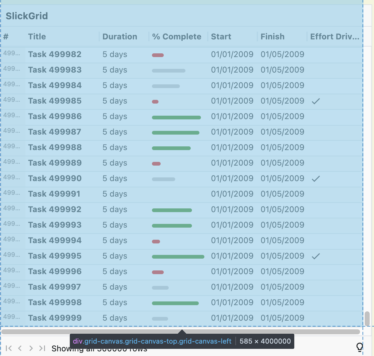
The container div height has been clamped at 4 million pixels. The code compensates for the smaller container size by mapping backward and forward between the container’s coordinate space and the larger grid coordinate space. The way it does it is fascinating.
It divides the grid coordinate space into “pages” that are 40 thousand pixels high. Each page is mapped into the container div coordinate space using an offset. There’s no scaling. Our grid is 12.5 million pixels high which is over 300 pages. There’s only room for 100 pages in the container div. How does that work? The pages overlap.

SlickGrid is trying to reconcile two seemingly incompatible objectives. First, you should be able to scroll across the entire grid. As the container is smaller than the grid, that means scaling up your movement. If you scroll the container down one million pixels, that should correspond to scrolling the grid down three million pixels. However, you should also be able to scroll down by a few rows. If you click on the scroll bar below the handle, that should scroll the bottom row in the viewport to the top. If the container has scrolled down 500 pixels, the grid should scroll down 500 pixels, not 1500 pixels.
The trick is to change behavior depending on the size of the change. If you scroll by more than the size of the viewport (e.g. clicking on the handle and dragging), it’s like you’re flicking through a rolodex. The grid uses the scrollbar position to select a page. The display is jumping from the top few rows of one page to the top few rows of the next. To the user, it looks like you’re just scrolling through really fast.
If you scroll by less than the size of the viewport (e.g. clicking below the handle), the grid scrolls within the current page, letting you explore the rows below the top few. This all works surprisingly well. If you’re looking carefully, you can see the odd glitch when small scale scrolling crosses a page boundary. The scroll bar handle jumps backwards to the offset where the next page should start. However, as there are at least a 100 pages, the scroll bar handle only jumps back a few pixels.
So, is it time to change course? Abandon React, at least for the grid, and switch to SlickGrid? Unfortunately, that’s not really an option. SlickGrid only provides vertical virtual scrolling. The expected use case is displaying large numbers of entities with a fixed number of columns. Given the size and maturity of the code base, I don’t think trying to introduce horizontal virtual scrolling over an unlimited number of columns will be practical.
React-Virtualized
The other grid control I found is react-virtualized. React-virtualized is the heavyweight, everything but the kitchen sink, predecessor of react-window. The idea behind react-window was to use the lessons learnt from react-virtualized to build a more minimal, flexible, focused component. Looks like one of things lost in the rewrite was support for large grids.
Like react-window, react-virtualized has online examples. I used the Grid example which lets you change the numbers of rows and columns while it’s running. I configured it for a million rows and a million columns and had a play.
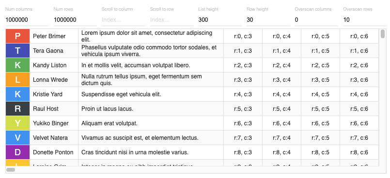
Dragging the vertical scrollbar around worked as expected and I was able to reach row 999999. The horizontal scrollbar was “janky”, behaving like the variable column width react-window grid. I was able to reach column 999999 eventually. You can see from the image that the first three columns have different sizes, but the rest of the million columns are identical, at 80 pixels wide. Checking the code shows that there’s no estimatedColumnSize property set and the default is 100. Easy enough to fix.
Small scale scrolling is less than ideal. If I click below the vertical scroll handle, row 15 moves to the top rather than row 8. If I click to the right of the horizontal scroll handle, column 38 moves to the left side rather than column 6. React-virtualized uses simple scaling to map between grid and container space.
Conclusion
One step forward, two steps back. I’m not having much luck finding an off the shelf, open source grid control that meets my needs.
Where do I go next? Fork an existing component and hack it as needed? Write something from scratch? See if there’s anything better in a different framework ecosystem? Try an approach that doesn’t rely on the DOM and native scrollbars?
Gives me lots to dig into, next time.